
We have had a phenomenal response to our recent “Freebie” offer of 2 months’ Analysis on the FTSE and Cable, to help navigate through what could be a pivotal few months for the UK. On that basis we have a whole load of new readers, so I thought it would be useful to take a look at what’s in our reports, as there are many hidden gems that can be useful for traders and investors alike.
So let’s have a run through:
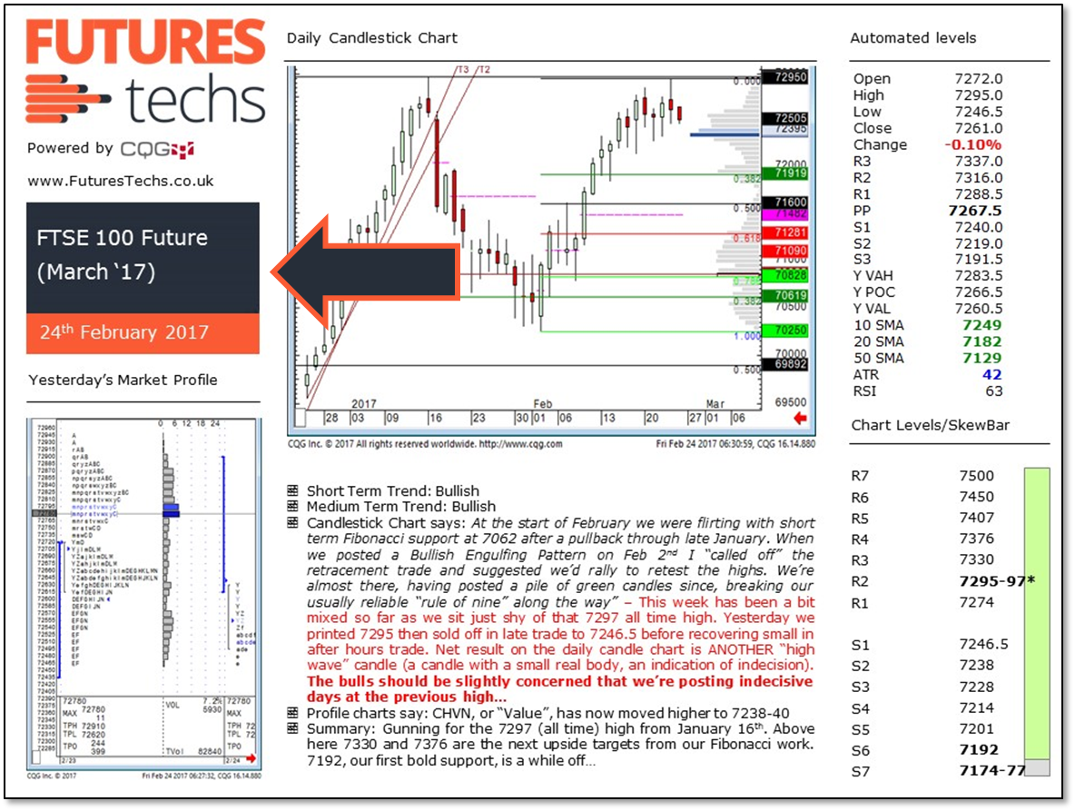
Maybe obvious: What the report covers!
But please note, we look at the Futures, not the “Cash” Index for Equity Indices, so there may be a difference in price and you need to adjust accordingly if you’re trading the “Cash” Index.
For example at the time of writing this report March ‘17 Futures were trading at a 16 point discount to the “cash” Index, so that 7192 level at S6 is actually 7208 on the “Cash” chart.
Candlestick Chart; generally daily…
Green candles are days where the market closes higher than where it opened, so bullish days.
Red candles are formed when the market closes below it’s open.
Sometimes we will post “day session only” charts that strip out the overnight price action. Important gap levels can be gleaned from these charts.
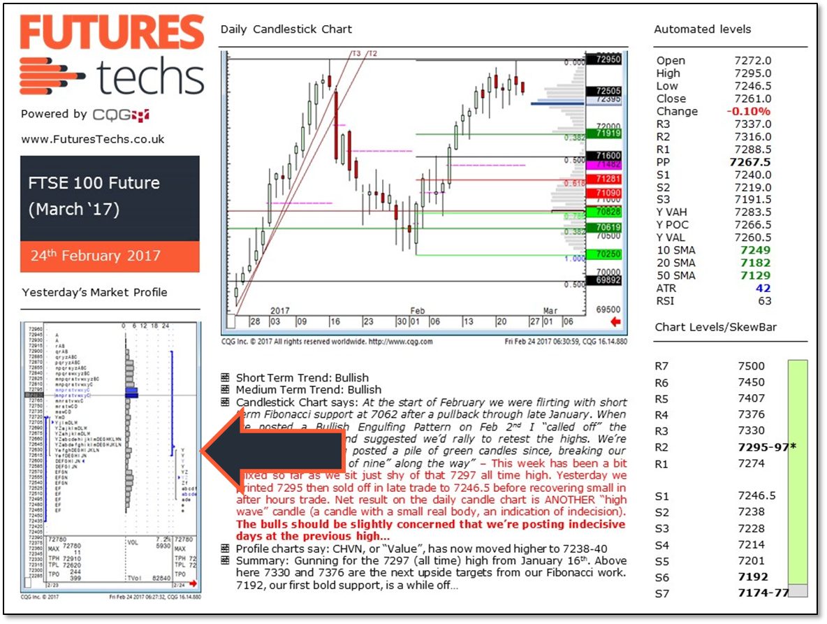
Market Profile chart. Shows the previous day’s Profile.
The small box below shows the following values(for the previous day’s Profile):
TPH – Value Area high using TPO count
TPL – Value Area low using TPO count
The long blue line on the Volume Profile histogram is the TPO POC
All three of these levels are worth keeping an eye on the following day.
We also highlight vacuum support or resistance levels with a horizontal blue line.
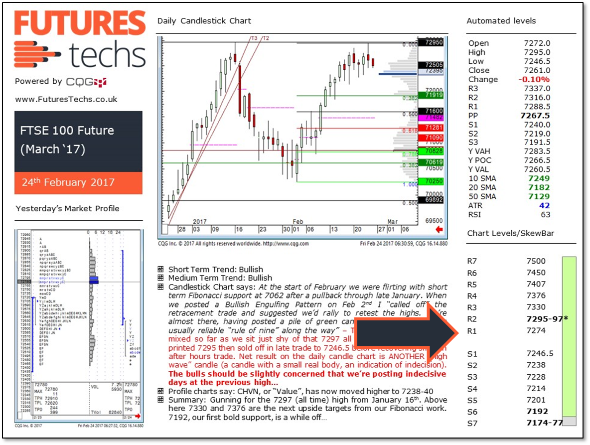
“Manual” levels; from our Analysts’ daily review.
Levels in bold are deemed most important.
If a level is in brackets it means it could be support or resistance.
A level with a “*” next to it is an all time high/low.
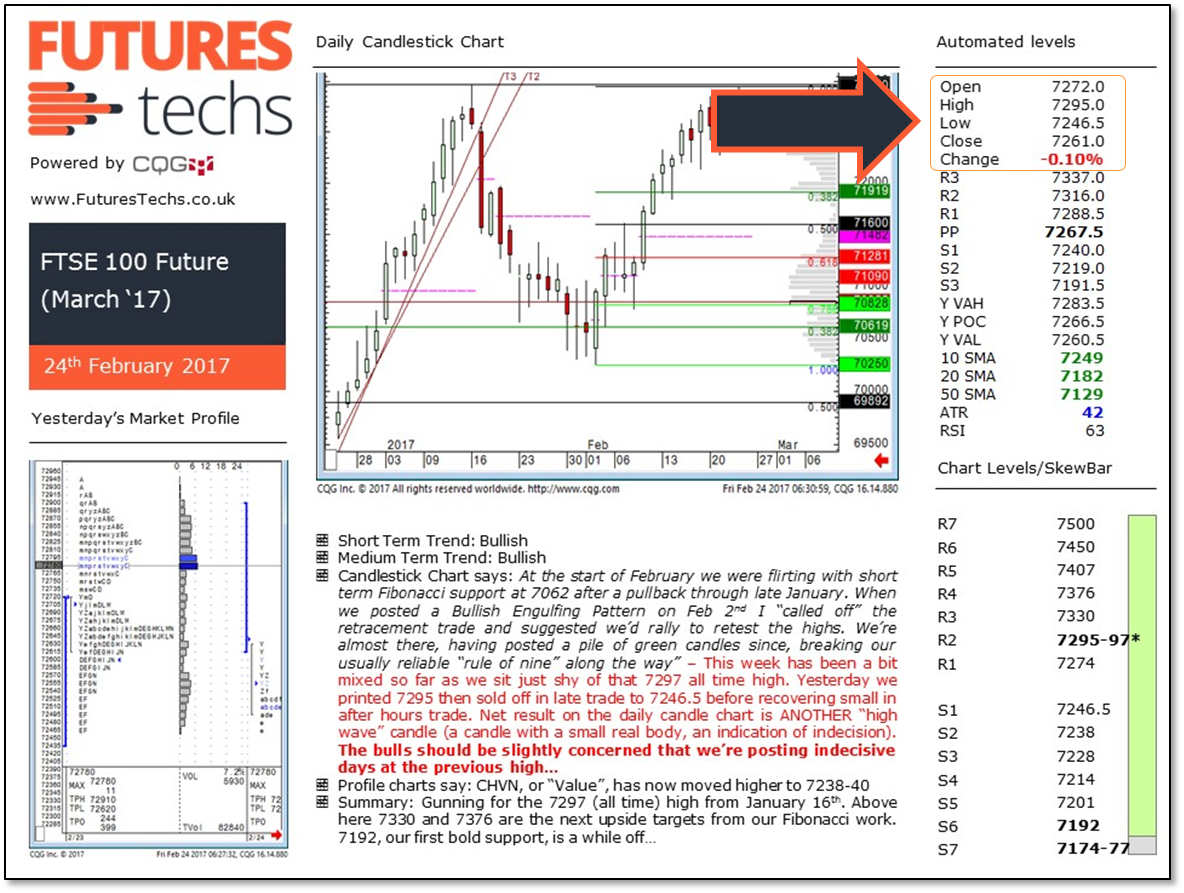
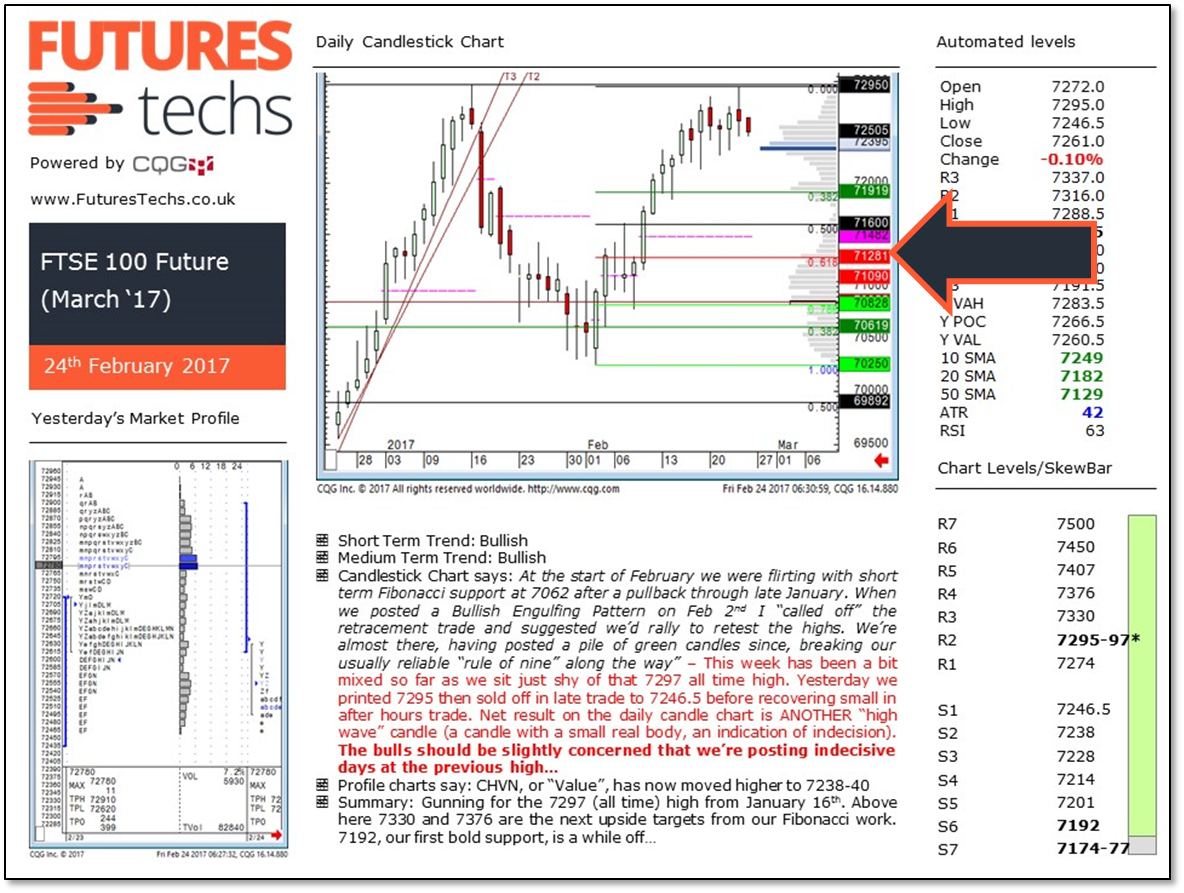
“Automated” levels; As it says, all of these levels are generated by CQG and are as follows:
Open, high, Low, Close, Change – Self explanatory
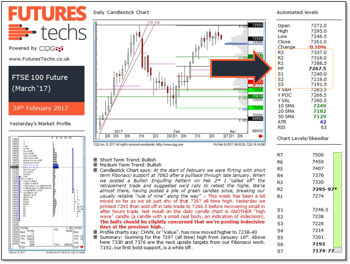
“Pivot Points”: 7 levels
R3 = H + 2( PP – L)
R2 = PP + ( H – L )
R1 = ( 2 x PP ) – L
PP = ( H + L + C ) / 3
S1 = ( 2 x PP ) – H
S2 = PP- ( H – L )
S3 = L – 2( H – PP )
Pivot Points were commonly used in the days of Pit trading but are not (IMO) so relevant now, although are still referenced by many traders, hence we include them in our reports!
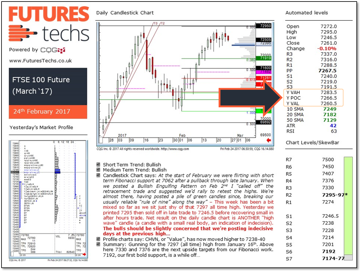
Market Profile Levels:
Yest MPHI – Yesterday’s Value Area High – using volume (tick for FX) data
Yest POC – Yesterday’s Volume Point of Control (tick for FX)
Yest MPLO – Yesterday’s Value Area Low using Volume (tick for FX) data
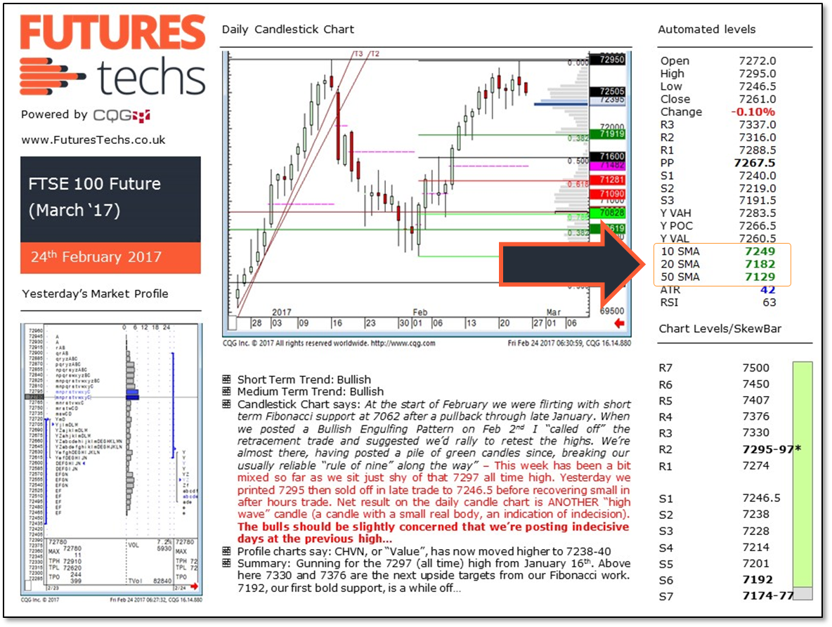
Moving Averages:
10, 20 and 50 day Simple Moving Averages
If these are in bullish order they will all be green
If they are in bearish order they will all be red
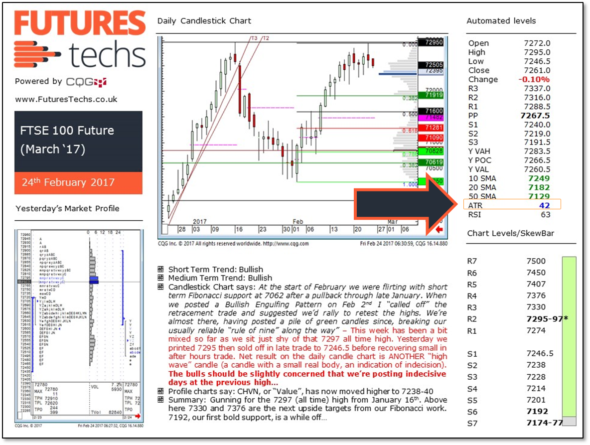
ATR – Average True Range
This is (in simple terms) the average daily range over the last 10 days, and is used by traders to tell them whether markets may be getting “stretched” at extremes, or whether you are experiencing a session of more extreme volatility
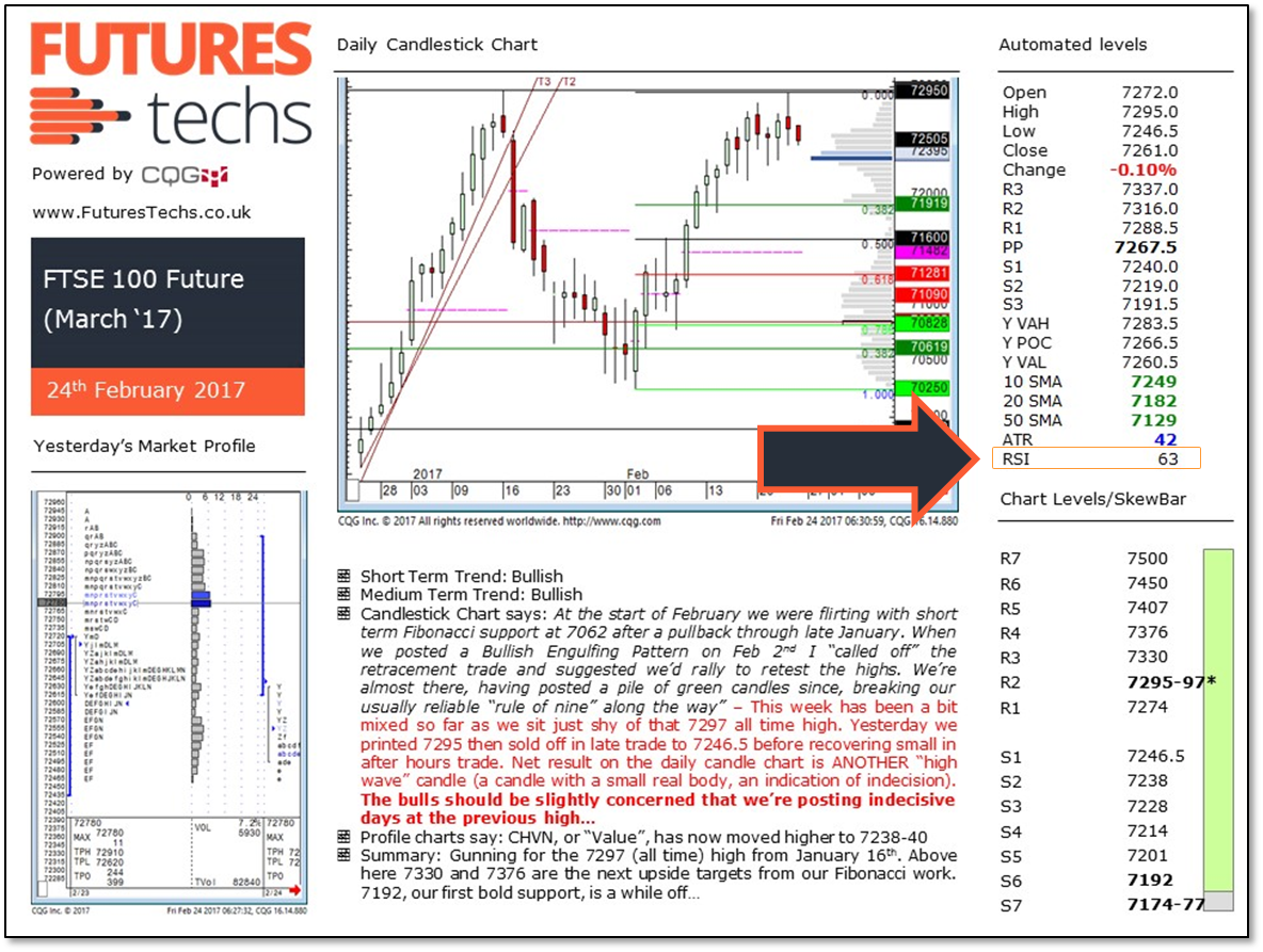
RSIRelative Strength Index - The speed and change of price move... More – “Relative Strength Index” Momentum study
Green = Overbought
Red = Oversold
The “theory” behind this is that a high reading for the RSIRelative Strength Index - The speed and change of price move... More (anything over 75) says the market is get “overbought” and possibly due a correction lower.
Conversely an RSIRelative Strength Index - The speed and change of price move... More reading below 25 says the selling has maybe gone too far.
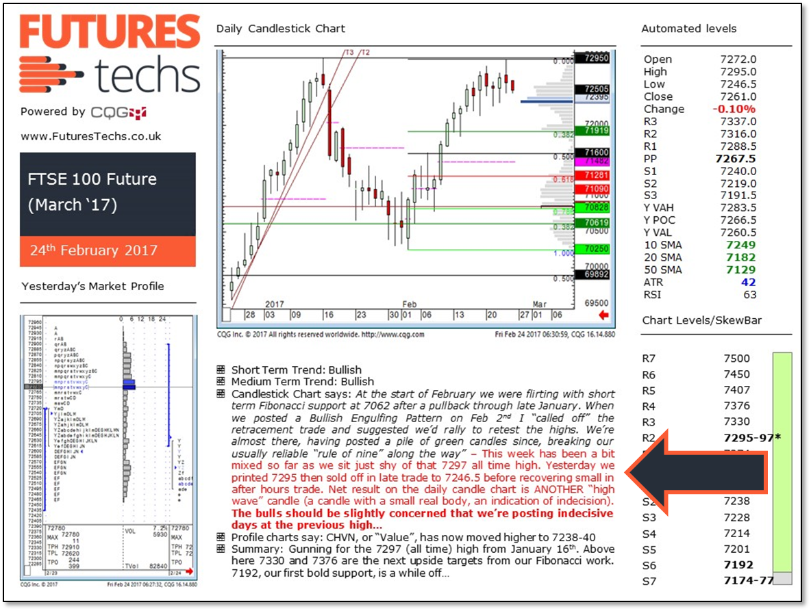
Commentary: All fairly self explanatory
Text in Italics is from previous days.
Text in red is an update.
“Short term trend” is the 2-4 week trend on the daily chart
“Medium term trend” is the “bigger picture” direction on the weekly charts.
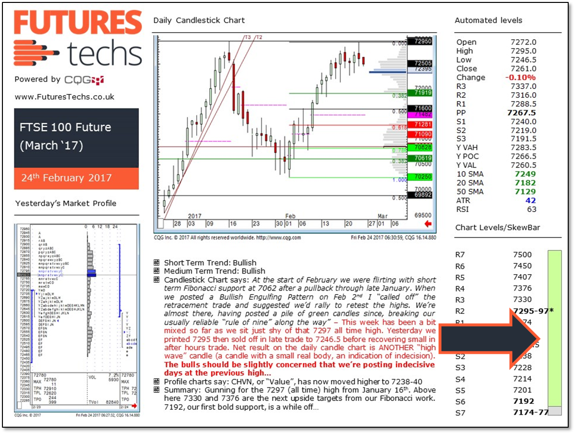
On our Futures reports we post 7 support and 7 resistance levels and also our very own “invention”; the “SkewBar”, coloured in Green, Grey and Red.
This is a levels based short term trend indicator.
Grey = Neutral
Green = Bullish
Red = Bearish
So for this report we are bullish above 7192, neutral below here. There is no red element showing, so we’re a long way from being bearish!
If you have any questions or queries please do drop us a message here