Recent Candlesticks suggest Gold may be on the turn, at least temporarily, and momentum studies back up the idea. Let’s dig a bit further.
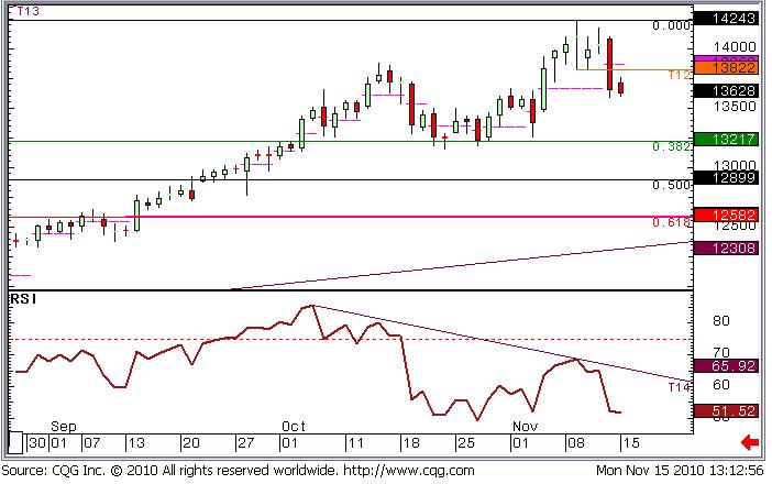
Figure 1: Gold Daily Candlestick Chart – September – November 2010
Figure 1 is a Daily Candlestick Chart for Comex Gold (all sessions). Last week we got up to a high of 1424.3 on Tuesday, but we came back to post a close at 1410.1, right on the opening price. This combination of a wide range with an open and close at more or less the same price gives us a candlestick pattern known as a “Doji”. This is a reversal pattern, as the buyers and sellers matched each other out if we take the day as a whole. We weren’t too concerned by this as we said in our daily commentary on Wednesday:
“So could that be it? Is this great run over? Not yet is the simple answer. We would want to see a few bold support levels taken out before calling it a day on such a strong move, not just one day of (albeit major) uncertainty/nerves”.
Tuesday’s low was 1382.2, a level that held firm on Wednesday and Thursday, keeping 1366, one of our “bold” supports protected. On our reports we post important support or resistance levels in bold type, hence the reference above. On Friday things started to creak, and as we were writing the reports (early on in European trade) 1382.2 was coming under fire. Here’s what we said at this time:
“If we break 1382.2 I’m going to turn my back on the bulls. If we then go on to break 1366 I’m going to turn bearish in the short term and look for a move to 1321.7”.
1382.2 broke that afternoon, and we sold off to 1359.6, ending the session at 1368.3.
Friday’s candle was large and filled/red and it’s real body totally surrounded/engulfed Thursday’s real body (the real body is the difference between the open and the close, and is “filled” (red) or “open” (green) depending on whether the market closed below it’s open, or closed above it’s open respectively.
This left us with another strong reversal pattern called a Bearish Engulfing Pattern.
It also left us with a large red candle, which prompts us to add a “Marabuzo line” to the chart, measuring from open to close on any session with a large move. This can often be a good support or (in this case) resistance level afterwards. In this instance it suggests that 1387 will cap any advances by the bulls, if indeed the bears are now in control of this market.
The old support at 1382.2 is also now a resistance level as this sort of thing often occurs.
So as long as we stay below 1387 we’re now going to look for the move to 1321.7 that we mentioned in last Friday’s comment, and if this level fails to hold up as support we can think about a deeper setback to 1258.2, or even long term trend support, at 1231.
Many Technical Analysts look at momentum studies with names like MACD (nothing to do with Hamburgers), Stochastics, and RSI (not repetitive strain injury, although sometimes it feels like it!). I don’t weigh on these Indicators heavily, but they can do a great job of adding weight to your thinking at times (or negating it, which can be just as useful). Right now we have a down-sloping RSI, and we have had since the start of October. What this suggests is that since the start of October the upside momentum has been on the wane. We may be making new highs, but the enthusiasm isn’t there to sustain the move at these current levels. This is known as a “Bearish Divergence”.
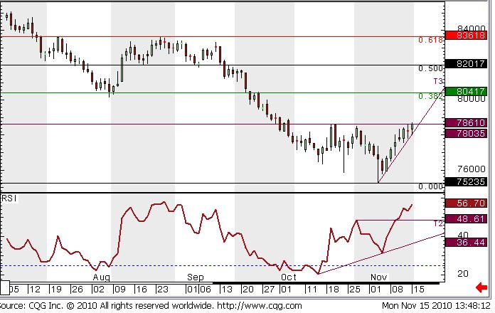
Obviously this idea will be helped if the Dollar sees further strength. EUR/USD has moved from 1.42 to 1.36 in around 2 weeks as Europe’s problems increase. The Dollar Index is a better barometer, and is the chart below (Figure 2). This shows we are nudging up against resistance at 78.61, where we fell over on October 20th, and again found resistance on October 27th. We want to see this level taken out to encourage this one to head to the next big resistance at 80.17-80.41. This sort of move will likely see further unwinding of Dollar denominated Commodity prices, like Gold!
Figure 2: Dollar Index Daily Candlestick Chart since July.
One final thing to note about this chart is how the RSI has been going up since the middle of October, even though we recnetly made a new low. This is the opposite situation to the Gold chart, and is known as a Bullish Divergence, suggesting that higher prices are around the corner.
Our clients benefit from this sort of analysis on an ongoing basis in our Daily Reports, which cover a wide range of products. To request a free trial please click here.
We cover Bonds, Equities, Commodities and Forex.
FuturesTechs’ award winning analysis has been helping the Trading Industry for 10 years now. Our chief analyst, Clive Lambert, is the author of “Candlestick Charts” a book introducing the basics of Candlestick Charting; and their Construction, and Psychology.


